I’m writing this post mainly for my own benefit to keep track of the current best practice for using Material Design with an Angular project.
At the time of writing version 6 of Angular has just dropped and I was suprised by the lack of direction when it came to implementing Material Design, Google’s own design language.
I’ve put in a few days research and come up with the stack I’m using for my latest project. I’ll update this post as I go until it drastically changes.
Last Updated - May 2018
Material Design Stack
There are currently three pieces of tech I use to get the full material design experience.
- Material 2
- Material Components Web
- Angular Flex Layout
Let’s take a look at each.
Material 2
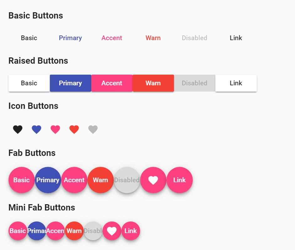
Material 2 is the Angular team’s implementation of Material Design components. These are ready to go immediately and are easy enough to install.
Installation
I don’t want to have to keep this post up to date with the changing installation process, but it’s only a few steps. Check it out here: https://material.angular.io/guide/getting-started
Usage
Best practice is to have a separate module to import just the components you want to use, like this:
import {MatButtonModule, MatCheckboxModule} from '@angular/material';

@NgModule({
  imports: [MatButtonModule, MatCheckboxModule],
  exports: [MatButtonModule, MatCheckboxModule],
})
export class MyOwnCustomMaterialModule { }
and then boom, just use a directive. Here’s a button example:
<button mat-button (click)="doStuff()">Click me!</button>

Material Components Web
NOTE - May 14 2018 - The components don’t work with Angular 6 yet. Just the layout.
The Material Components Web is a web framework dedicated to faithfully upholding the Material Design concept, but allowing use by any web technology rather than being tied into Angular.
It can be used in conjunction with the above Material 2 as a handy way to fill gaps that one or the other may not support.
In my case I primarily use the MDC for it’s layout-grid. This gives us the familiar 12-column grid system that bootstrap has made so easy and popular.
Installation
npm install @material/layout-grid
In your styles.scss, include this line:
@import "~@material/layout-grid/mdc-layout-grid";
Usage It’s a standard 12-column grid. You can use it like so:
<div class="mdc-layout-grid">
    <div class="mdc-layout-grid__inner">
        <div class="mdc-layout-grid__cell--span-6">
            Half here
        </div>
        <div class="mdc-layout-grid__cell--span-6">
            The other half here
        </div>
    </div>
</div>
If you’re already in a padded container, or if you’re nesting columns you can leave out the mdc-layout-grid.
<div class="mdc-layout-grid">
    <div class="mdc-layout-grid__inner">
        <div class="mdc-layout-grid__cell--span-6">
            <div class="mdc-layout-grid__inner">
                <div class="mdc-layout-grid__cell--span-4">nested baby</div>
                <div class="mdc-layout-grid__cell--span-4">nested baby</div>
                <div class="mdc-layout-grid__cell--span-4">nested baby</div>
            </div>
        </div>
        <div class="mdc-layout-grid__cell--span-6">
            The other half here
        </div>
    </div>
</div>
Angular Flex Layout
I use the flex layout system as a way to wrap a few components with a responsive layout. It also has some handy media-query/breakpoint code to help you dynamically change your UI from code as well as css.
The key advantage of this layout system is that you can bind sizes to angular properties, letting you gain huge control over the layout, especially when designing for both mobile and desktop at the same time.
Installation
https://github.com/angular/flex-layout/wiki/Using-Angular-CLI
Usage
https://github.com/angular/flex-layout/wiki/Declarative-API-Overview
<div fxLayout='column' class="zero">

  <div fxFlex="33" class="one" ></div>
  <div fxFlex="33%" [fxLayout]="direction" class="two">

    <div fxFlex="22%"    class="two_one"></div>
    <div fxFlex="205px"  class="two_two"></div>
    <div fxFlex="30"     class="two_three"></div>

  </div>
  <div fxFlex class="three"></div>

</div>
For usage in code use the following: https://github.com/angular/flex-layout/wiki/API-Documentation
import {ObservableMedia} from '@angular/flex-layout';
constructor(public media: ObservableMedia ) { ... }
Summary
Yep, it’s not straight forward. Hopefully a definitive leader emerges and we can focus on being productive. Until then, it’s a case of cherry picking to find the easiest solution.
Cheers!

